
## Read in the ts061 (LSOAs)
ts061 <- read.csv("data/census2021-ts061-lsoa.csv")2 Data Visualisation
2.1 Learning objectives
By the end of today’s session you should be able to:
- Produce static visualisations and maps using ggplot
- Produce more advanced static visualisations and maps, using advanced data wrangling techniques
- Produce interactive visualisations
- Explore reporting strategies for visualisation outputs
2.2 Data
For today’s practical, we will be using a couple of different datasets.
Firstly, we will be using data from the latest UK census - available from NOMIS. In particular, we will be looking at one specific census table; ‘Method of Travel to Work’, which describes the main method of transport people use to travel to work - e.g. by car, by bus, on foot etc.
For today’s, we will be using the table of data that is available for Lower Super Output Areas (LSOAs). Let’s go ahead and read the table of data in:
Let’s have a look at some of the attributes in the data:
## Examine attributes
head(ts061) date geography geography.code
1 2021 City of London 001A E01000001
2 2021 City of London 001B E01000002
3 2021 City of London 001C E01000003
4 2021 City of London 001E E01000005
5 2021 Barking and Dagenham 016A E01000006
6 2021 Barking and Dagenham 015A E01000007
Method.of.travel.to.workplace..Total..All.usual.residents.aged.16.years.and.over.in.employment.the.week.before.the.census
1 866
2 881
3 1000
4 496
5 888
6 1385
Method.of.travel.to.workplace..Work.mainly.at.or.from.home
1 639
2 676
3 618
4 203
5 192
6 370
Method.of.travel.to.workplace..Underground..metro..light.rail..tram
1 35
2 31
3 74
4 69
5 205
6 358
Method.of.travel.to.workplace..Train
1 17
2 10
3 21
4 25
5 104
6 177
Method.of.travel.to.workplace..Bus..minibus.or.coach
1 13
2 15
3 26
4 44
5 60
6 117
Method.of.travel.to.workplace..Taxi
1 4
2 2
3 4
4 2
5 1
6 8
Method.of.travel.to.workplace..Motorcycle..scooter.or.moped
1 3
2 1
3 4
4 3
5 5
6 3
Method.of.travel.to.workplace..Driving.a.car.or.van
1 18
2 19
3 24
4 33
5 227
6 220
Method.of.travel.to.workplace..Passenger.in.a.car.or.van
1 0
2 3
3 7
4 1
5 10
6 21
Method.of.travel.to.workplace..Bicycle Method.of.travel.to.workplace..On.foot
1 24 109
2 25 92
3 62 143
4 18 90
5 6 61
6 21 71
Method.of.travel.to.workplace..Other.method.of.travel.to.work
1 4
2 7
3 17
4 8
5 17
6 19Before we start working with this data, we are going to tidy it up slightly. As you can probably see, the column names are long and messy, and the values in each column are raw counts, instead of percentages.
My preferred approach to tidying up data or ‘data wrangling’ is to use the ‘tidyverse’ suite of packages. One of the real benefits of tidyverse are tools called ‘pipes’ (%>%), which are used to emphasise a sequence of actions, linking a series of different data cleaning steps into one nice block of code.
In the example below I show how you can use pipes to select some desired columns (by name), rename them, and then convert one a percentage.
## An example of data wrangling with pipes
example <- ts061 %>%
select(geography.code,
Method.of.travel.to.workplace..Total..All.usual.residents.aged.16.years.and.over.in.employment.the.week.before.the.census,
Method.of.travel.to.workplace..Work.mainly.at.or.from.home) %>% ## SELECT is used to select specific columns
rename(LSOA21CD = geography.code,
total = Method.of.travel.to.workplace..Total..All.usual.residents.aged.16.years.and.over.in.employment.the.week.before.the.census,
work_from_home = Method.of.travel.to.workplace..Work.mainly.at.or.from.home) %>% ## RENAME is used to rename columns individually
mutate(pctWFH = (work_from_home / total) * 100) ## MUTATE is used to create new columns, or modify existing ones
## Inspect
head(example) LSOA21CD total work_from_home pctWFH
1 E01000001 866 639 73.78753
2 E01000002 881 676 76.73099
3 E01000003 1000 618 61.80000
4 E01000005 496 203 40.92742
5 E01000006 888 192 21.62162
6 E01000007 1385 370 26.71480Ok, so that’s just one example of some steps you might take to tidy up a raw dataset from NOMIS into something a little bit more user friendly. There are lots of additional ‘data wrangling’ steps you might take as an analyst, some of which we will come onto later on, but for now we just need to apply these techniques to ts061 to get it ready for today’s practical, as below.
In the code block below, I am going to select columns by index rather than name, which works much better when you have a lot more columns. I am also going to apply the setNames() function to set all column names at once:
## Tidy up ts061
ts061_clean <- ts061 %>%
select(3:15) %>% ## selects all columns between index 3 and 15
setNames(c("LSOA21CD", "total", "work_from_home", "underground_metro", "train", "bus_minibus_coach",
"taxi", "motorcycle", "car_driving", "car_passenger", "bicycle", "foot", "other")) %>% ## applies new column names to those columns
mutate(work_from_home = (work_from_home / total) * 100, underground_metro = (underground_metro / total) * 100,
train = (train / total) * 100, bus_minibus_coach = (bus_minibus_coach / total) * 100,
taxi = (taxi / total) * 100, motorcycle = (motorcycle / total) * 100,
car_driving = (car_driving / total) * 100, car_passenger = (car_passenger / total) * 100,
bicycle = (bicycle / total) * 100, foot = (foot / total) * 100, other = (other / total) * 100)
## Inspect
head(ts061_clean) LSOA21CD total work_from_home underground_metro train bus_minibus_coach
1 E01000001 866 73.78753 4.041570 1.963048 1.501155
2 E01000002 881 76.73099 3.518729 1.135074 1.702611
3 E01000003 1000 61.80000 7.400000 2.100000 2.600000
4 E01000005 496 40.92742 13.911290 5.040323 8.870968
5 E01000006 888 21.62162 23.085586 11.711712 6.756757
6 E01000007 1385 26.71480 25.848375 12.779783 8.447653
taxi motorcycle car_driving car_passenger bicycle foot other
1 0.4618938 0.3464203 2.078522 0.0000000 2.7713626 12.586605 0.4618938
2 0.2270148 0.1135074 2.156640 0.3405221 2.8376844 10.442679 0.7945516
3 0.4000000 0.4000000 2.400000 0.7000000 6.2000000 14.300000 1.7000000
4 0.4032258 0.6048387 6.653226 0.2016129 3.6290323 18.145161 1.6129032
5 0.1126126 0.5630631 25.563063 1.1261261 0.6756757 6.869369 1.9144144
6 0.5776173 0.2166065 15.884477 1.5162455 1.5162455 5.126354 1.3718412So now we have a nice tidy table, where each variable is now a percentage. The final step is to add some additional geographies to the table - in this case we will append on the corresponding Local Authority District for each LSOA.
The Open Geography Portal is a great place to find lookup tables for any administrative datasets in the UK. The specific table we have given you provides a lookup between Output Areas (OAs), Lower Super Output Areas (LSOAs), Middle Super Output Areas (MSOAs), Local Enterprise Partnerships (LEPs) and Local Authority Districts (LADs). Let’s read in the lookup table:
## Read in the lookup table
lookup <- read.csv("data/OAs_to_LSOAs_to_MSOAs_to_LEP_to_LAD_(May_2022)_Lookup_in_England.csv")
## Have a look at the data
head(lookup) OA21CD LSOA21CD LSOA21NM MSOA21CD MSOA21NM LEP21CD1
1 E00060358 E01011968 Hartlepool 014D E02006909 Hartlepool 014 E37000034
2 E00060359 E01011968 Hartlepool 014D E02006909 Hartlepool 014 E37000034
3 E00060360 E01011968 Hartlepool 014D E02006909 Hartlepool 014 E37000034
4 E00060361 E01011968 Hartlepool 014D E02006909 Hartlepool 014 E37000034
5 E00060362 E01011970 Hartlepool 001C E02002483 Hartlepool 001 E37000034
6 E00060363 E01011970 Hartlepool 001C E02002483 Hartlepool 001 E37000034
LEP21NM1 LEP21CD2 LEP21NM2 LAD22CD LAD22NM ObjectId
1 Tees Valley E06000001 Hartlepool 1
2 Tees Valley E06000001 Hartlepool 2
3 Tees Valley E06000001 Hartlepool 3
4 Tees Valley E06000001 Hartlepool 4
5 Tees Valley E06000001 Hartlepool 5
6 Tees Valley E06000001 Hartlepool 6Lookup tables often contain more information than you actually need. For example, the one above is structured so that every row is an Output Area (e.g., E00060361), and then the various columns link to other geographies - LSOA, LEP, LAD etc. What we are interested in doing is joining the LSOA-level census data from earlier, with the LAD-specific columns in the lookup table. So, we need to do a couple of things to the lookup table:
## Tidy up the lookup
lookup_clean <- lookup %>%
select(LSOA21CD, LAD22CD, LAD22NM) %>% ## select the LSOA and LAD columns
distinct() ## keeps only unique values, i.e., dropping all the additional rows for Output Areas
## Look at the dataset
head(lookup_clean) LSOA21CD LAD22CD LAD22NM
1 E01011968 E06000001 Hartlepool
2 E01011970 E06000001 Hartlepool
3 E01011969 E06000001 Hartlepool
4 E01011971 E06000001 Hartlepool
5 E01033465 E06000001 Hartlepool
6 E01033467 E06000001 HartlepoolThe final step is to attach the Local Authority variables (LAD22CD, LAD22NM) to our main dataset. This can be done in a number of ways, but I have a personal preference for integrating these kind of joins within pipes (as we have done so far).
## Attach the LAD variables to the main dataset
db <- ts061_clean %>%
inner_join(lookup_clean, by = "LSOA21CD")
## Look at the new attributes
colnames(db) [1] "LSOA21CD" "total" "work_from_home"
[4] "underground_metro" "train" "bus_minibus_coach"
[7] "taxi" "motorcycle" "car_driving"
[10] "car_passenger" "bicycle" "foot"
[13] "other" "LAD22CD" "LAD22NM" Ok, so we have a nice data set that is cleaned and ready for use in today’s practical.
2.3 Static data visualisation (basic)
For most of today’s practical, we are going to be using the ggplot2 package to learn how to create nice visualisations in R. It is a really awesome package, has really excellent documentation and the quality of graphics it can produce is (arguably) second-to-none.
HOWEVER…. Lot’s of people say that ggplot is a tricky syntax to get used to, as it requires a more ‘programmatic’ style of coding (e.g. piping), instead of line-by-line.
2.3.1 The ‘grammar of graphics’
Before getting stuck into ggplot, there are a couple of key fundamentals that you need to learn, which comprise something called the ‘grammar of graphics’ The first relates to specifying the specific dataset that you are using to create a plot - it is very easy to do this:
## Specify db as our source of data
ggplot(data = db)
As you can see, ggplot has opened a blank canvas which is going to rely on data from the ‘db’ object to create some form of visualisation.
The next fundamental relates to how the information from that source of data is going to be represented, which relies on use of ggplot’s mapping argument - aes(). With this argument, you are able to identify how different variables from your dataset can be visually represented.
So for example, let’s say we are interested in looking at the association between two variables in our dataset, plotting one on each axis:
## Set some ggplot aesthetics
ggplot(data = db, aes(x = work_from_home, y = car_driving)) 
Ggplot has now established that those are the two variables you wish to create your visualisation around, and has added axis’ that reflect the underlying distribution of these variables. The final fundamental stage is to introduce ‘geoms’ to our existing plot. Geoms are different types of objects that are used to represent data, including points, bars, lines etc. etc. We will explore lots of these today, but for now, let’s just consider plotting a scatter between the two variables in the plot above.
## Add your first geom
ggplot(data = db, aes(x = work_from_home, y = car_driving)) +
geom_point()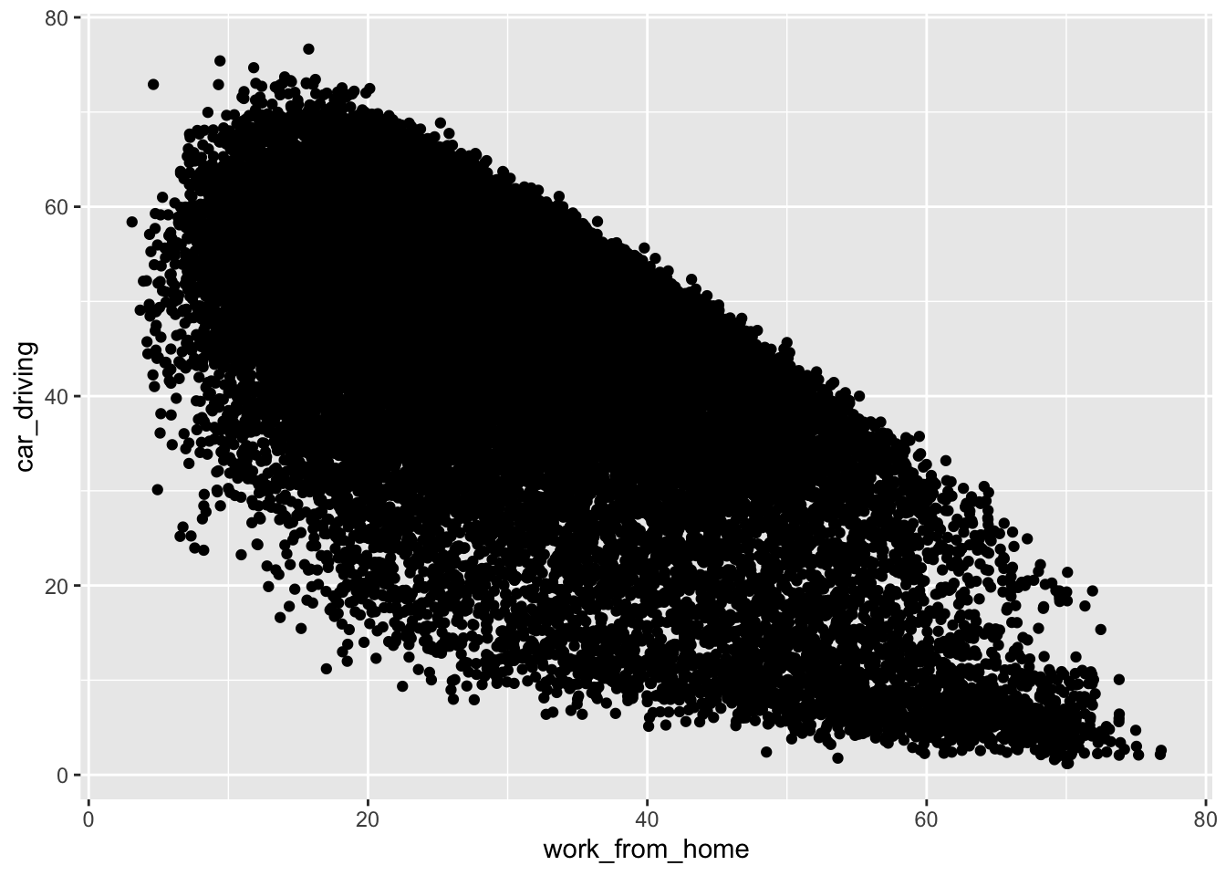
Excellent! Your first ggplot visualisation is now ready. It doesn’t look the best (right now), but hopefully you have a good understanding of those three fundamental concepts when using ggplot for plotting. So to recap, for every ggplot visualisation you need to be clear on:
- Which dataset is being used to generate the visualisation
- How you are going to map your variables to generate plot aesthetics (aes)
- The specific type of geom that you want to use
Before we move on to exploring other types of data visualisation, let’s think about how we can make this plot better, by changing some of the default options.
## Change some point parameters - size and transparency
ggplot(data = db, aes(x = work_from_home, y = car_driving)) +
geom_point(alpha = 0.3, size = 0.35) ## alpha is used to change the transparency of points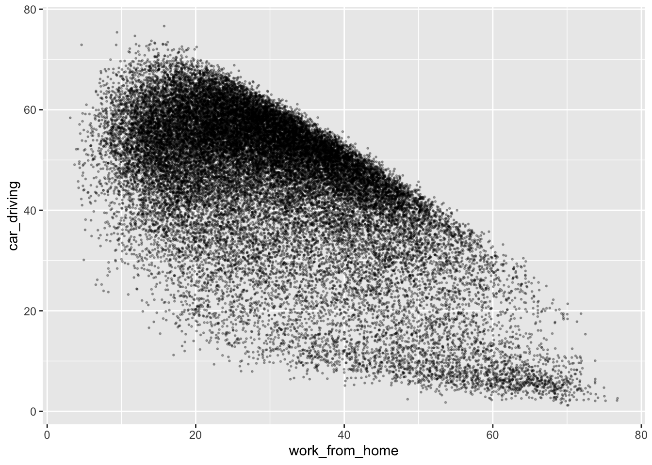
## Add a trend line
ggplot(data = db, aes(x = work_from_home, y = car_driving)) +
geom_point(alpha = 0.3, size = 0.35) +
geom_smooth(method = "lm") ## geom_smooth is used to add an overall trend line to a plot`geom_smooth()` using formula = 'y ~ x'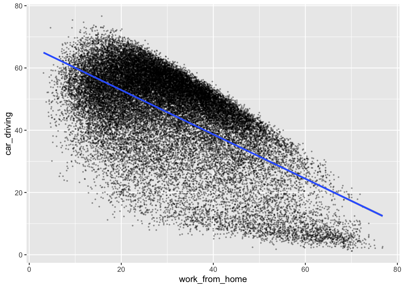
## Change axis titles
ggplot(data = db, aes(x = work_from_home, y = car_driving)) +
geom_point(alpha = 0.3, size = 0.35) +
geom_smooth(method = "lm") +
labs(x = "Population who work from home (%)", y = "Population who drive to work (%)") ## change the x and y axis labels`geom_smooth()` using formula = 'y ~ x'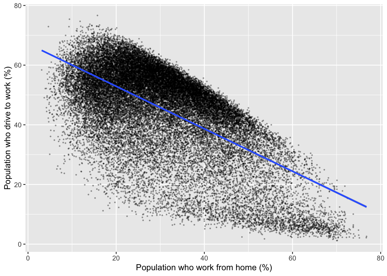
For official reporting and academic publications, it is also important cite the data source used to generate the output, which can be done nicely with a caption in the labs() command:
## Cite the data source
ggplot(data = db, aes(x = work_from_home, y = car_driving)) +
geom_point(alpha = 0.3, size = 0.35) +
geom_smooth(method = "lm") +
labs(x = "Population who work from home (%)", y = "Population who drive to work (%)",
caption = "Data: UK Census (2021) - 'Method of travel to work' (ts061)") ## set a caption for the plot`geom_smooth()` using formula = 'y ~ x'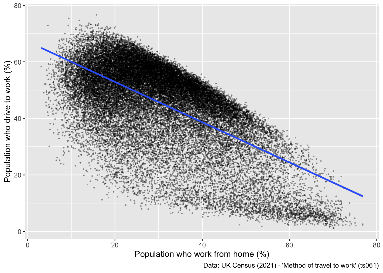
The final tweak you might make to a plot like this is to change the plot theme. Ggplot has a number of themes that can be selected to change the general appearance of a plot. Here is one example:
## Change the plot theme
ggplot(data = db, aes(x = work_from_home, y = car_driving)) +
geom_point(alpha = 0.3, size = 0.35) +
geom_smooth(method = "lm") +
labs(x = "Population who work from home (%)", y = "Population who drive to work (%)",
caption = "Data: UK Census (2021) - 'Method of travel to work' (ts061)") +
theme_bw() ## sets a theme to the plot`geom_smooth()` using formula = 'y ~ x'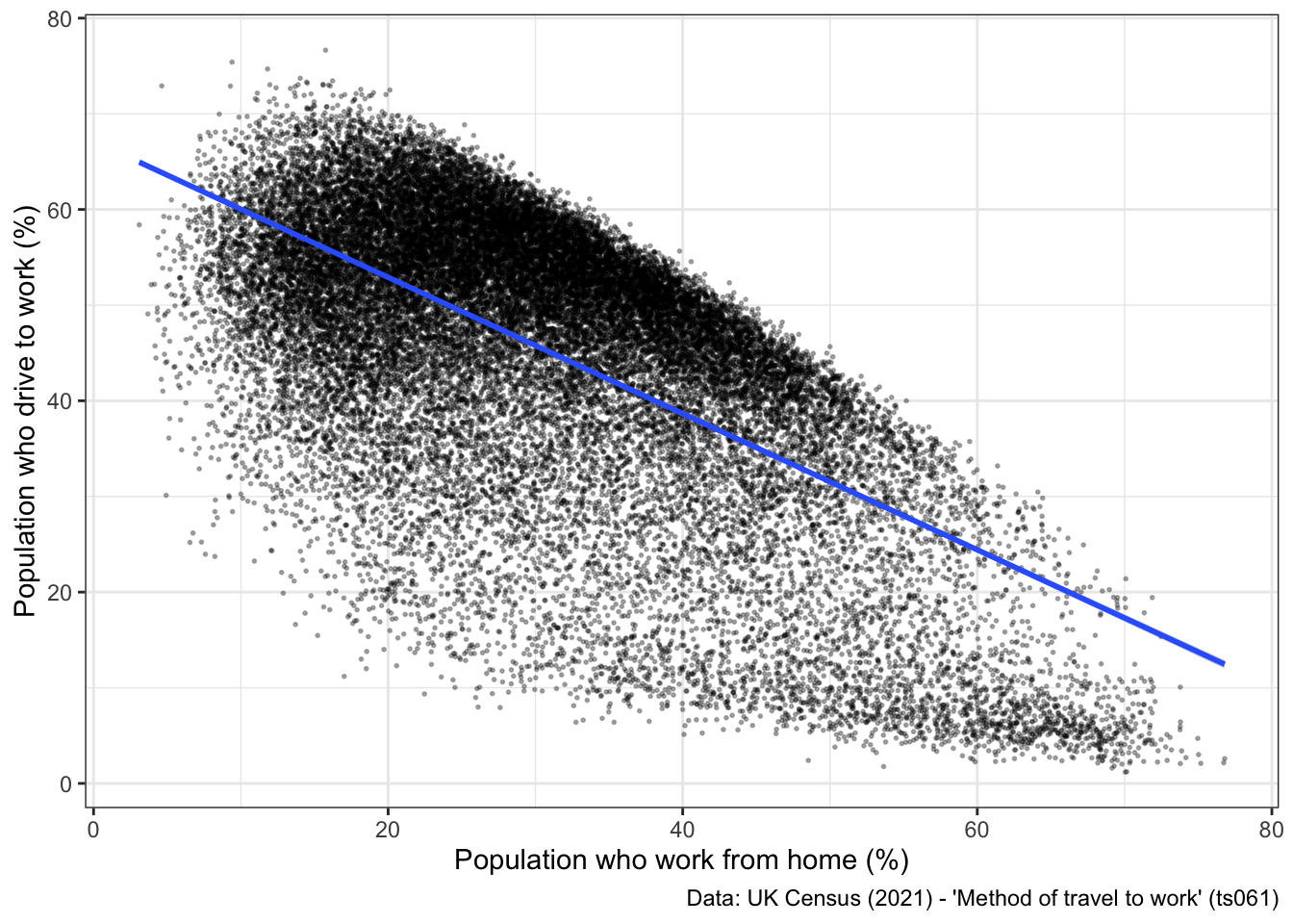
2.3.2 Independent exercise - Over to you!
Have a go at making some other modifications to the plot above:
- Change the variables that are being plotted on the x and y axis, to look at associations between different modes of travel.
- Explore different themes, and see which one you like most.
- (optional) See if you can figure out how to scale the x and y axis to be between 0 and 100, using the xlim() and ylim() commands.
## Patrick's attempt
ggplot(data = db, aes(x = work_from_home, y = car_driving)) +
geom_point(alpha = 0.3, size = 0.35) +
geom_smooth(method = "lm") +
xlim(0, 100) +
ylim(0, 100) +
labs(x = "Population who work from home (%)", y = "Population who drive to work (%)",
caption = "Data: UK Census (2021) - 'Method of travel to work' (ts061)") +
theme_minimal()`geom_smooth()` using formula = 'y ~ x'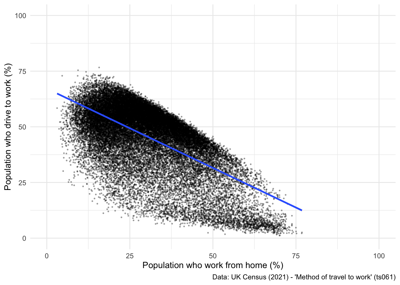
2.3.3 Other static visualisations
Now that you have a good understanding of how to construct a basic scatter plot using ggplot, and how to change some of the parameters to make your plot more visually appealing, we are going to do a quick overview of some simple visualisation techniques and how to build these in ggplot.
Firstly, let’s have a look at building a histogram. NOTE: histograms are uni-dimensional, so you only need to set one variable in the aes() command:
## Compute a histogram for one variable.
ggplot(data = db, aes(x = work_from_home)) +
geom_histogram(fill = "orange") +
labs(x = "Population who work from home (%)", y = "Number of LSOAs",
caption = "Data: UK Census (2021) - 'Method of travel to work' (ts061)") +
theme_minimal()`stat_bin()` using `bins = 30`. Pick better value with `binwidth`.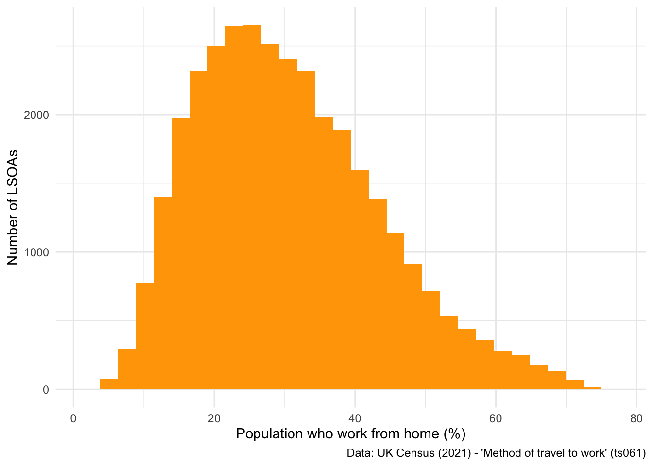
Alternatively, if you don’t like bar-style histograms, you can swap geom_histogram() for geom_density() to achieve a similar output:
## Different style of histogram
ggplot(data = db, aes(x = work_from_home)) +
geom_density(fill = "orange") +
labs(x = "Population who work from home (%)", y = "Number of LSOAs",
caption = "Data: UK Census (2021) - 'Method of travel to work' (ts061)") +
theme_minimal()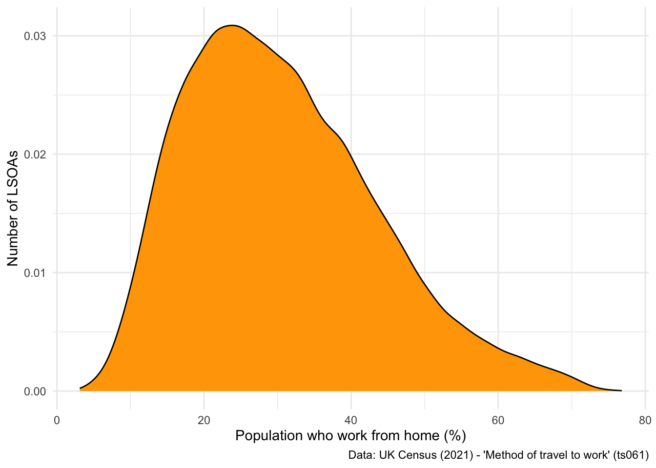
We can also very easily plot a bar chart using ggplot. Let’s look at the distribution of LSOAs across LADs.
But first, let’s filter our dataset to only look at LSOAs within Liverpool City Region Combined Authority (LCRCA):
## Filter to the six LADs that make up Liverpool City Region Combined Authority
db_lcr <- db %>%
filter(LAD22NM == "Liverpool" | LAD22NM == "Wirral" | LAD22NM == "St. Helens" | LAD22NM == "Sefton" | LAD22NM == "Knowsley" | LAD22NM == "Halton") ## filter allows you to filter specific values## Plot a bar chart
ggplot(data = db_lcr, aes(x = LAD22NM)) +
geom_bar(fill = "orange") +
labs(x = "Local Authority District", y = "Number of LSOAs",
caption = "Data: UK Census (2021) - 'Method of travel to work' (ts061)") +
theme_minimal()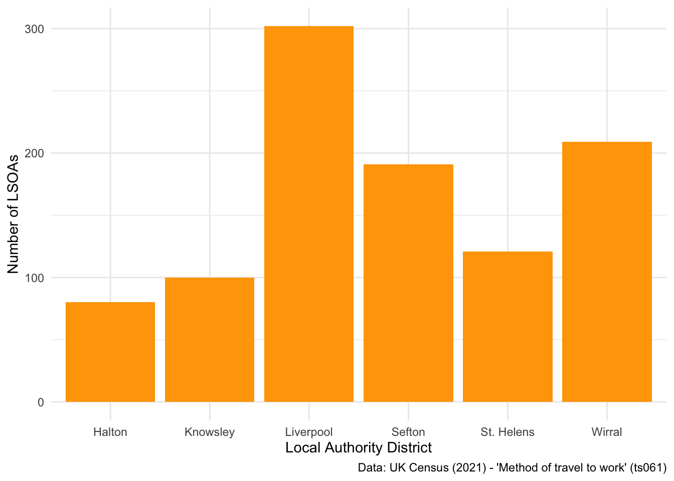
By default, when you have one variable on the x axis and call geom_bar(), ggplot will return a count of the number of rows in each x axis value.
Sometimes, it’s more useful to flip the axis on a plot, especially when you have a lot of categories:
## Flip the axis
ggplot(data = db_lcr, aes(x = LAD22NM)) +
geom_bar(fill = "orange") +
labs(x = "Local Authority District", y = "Number of LSOAs",
caption = "Data: UK Census (2021) - 'Method of travel to work' (ts061)") +
theme_minimal() +
coord_flip() ## this command swaps the x and y axis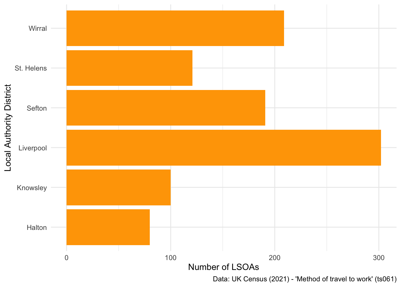
Finally, you might be interested in changing how the bars are ordered, going from lowest to highest values.
## Reorder bar plot
ggplot(data = db_lcr, aes(x = fct_infreq(LAD22NM))) + ## Use the fct_infreq to reorder the x axis values
geom_bar(fill = "orange") +
labs(x = "Local Authority District", y = "Number of LSOAs",
caption = "Data: UK Census (2021) - 'Method of travel to work' (ts061)") +
theme_minimal() +
coord_flip()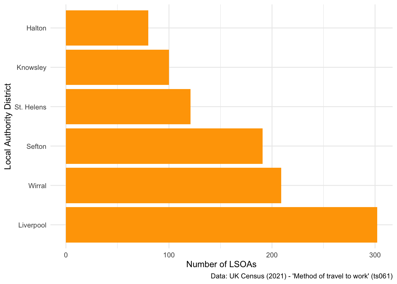
Or from highest to lowest:
## Reorder bar plot
ggplot(data = db_lcr, aes(x = fct_rev(fct_infreq(LAD22NM)))) + ## Use the fct_rev() and fct_infreq() commands to reorder the x axis values
geom_bar(fill = "orange") +
labs(x = "Local Authority District", y = "Number of LSOAs",
caption = "Data: UK Census (2021) - 'Method of travel to work' (ts061)") +
theme_minimal() +
coord_flip()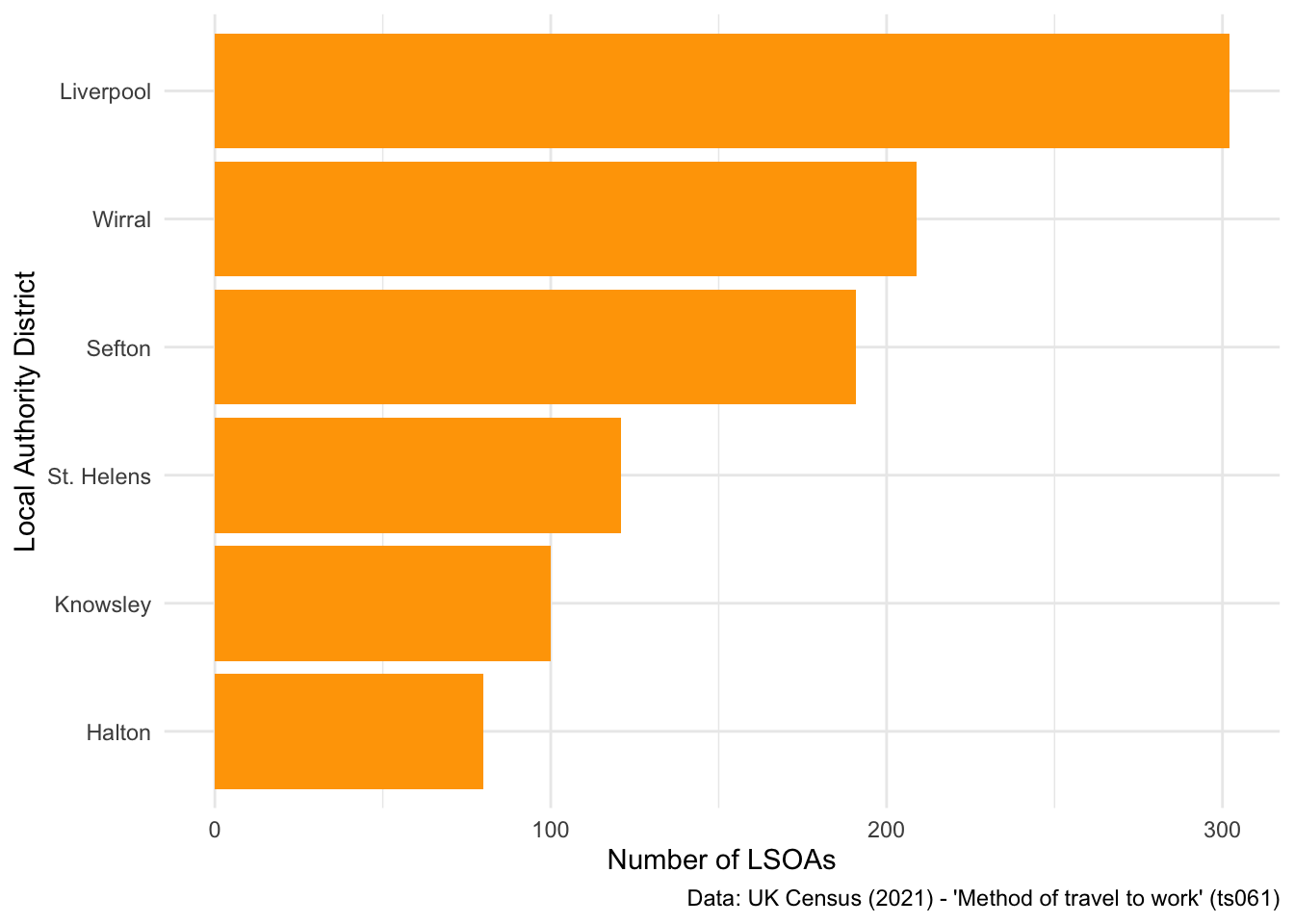
What if we wanted to look at the underlying distribution of different commuting methods across the LADs? I really like dotplots as a visualisation technique, and published a paper using one recently.
Let’s use a dotplot to look at the distribution of walking commuters across the six LADs:
## Examine differences in people who walk to work
ggplot(data = db_lcr, aes(x = LAD22NM, y = foot)) +
geom_dotplot(binaxis = "y", stackdir = "center", stackratio = 0.5, dotsize = .3) +
labs(x = "Local Authority District", y = "Population who walk to work(%)",
caption = "Data: UK Census (2021) - 'Method of travel to work' (ts061)") +
theme_minimal()Bin width defaults to 1/30 of the range of the data. Pick better value with
`binwidth`.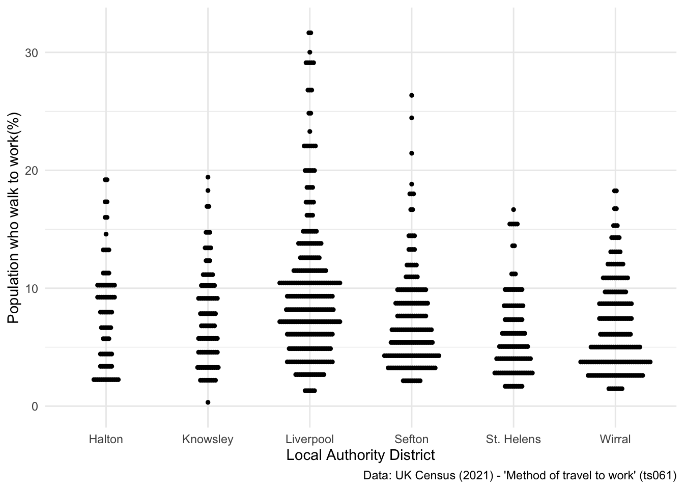
However, as you’re probably thinking, something more advanced might be needed to look at these differences. For example, if you calculated the average percentage of people who walk to work across the six LADs, what interesting story might that tell?
We will explore some of these ideas in the next part of the course, where I will show you how to reshape dataframes, and the importance of doing so for producing really powerful visualisations.
2.4 Static data visualisation (advanced)
Ok, so by now you should understand the basics of producing static visualisations with ggplot. Now, we are going to work towards building some better visualisations, which are not possible to achieve without learning more about reshaping data. If you are familar with pivot tables, its a similar concept!
So take our dataset for Liverpool City Region:
head(db_lcr) LSOA21CD total work_from_home underground_metro train bus_minibus_coach
1 E01006412 570 11.22807 0.0000000 0.7017544 16.666667
2 E01006413 524 12.59542 0.0000000 0.9541985 19.656489
3 E01006414 481 9.97921 0.0000000 0.8316008 20.166320
4 E01006415 956 18.93305 0.2092050 1.8828452 5.125523
5 E01006416 588 15.47619 0.1700680 1.1904762 9.353741
6 E01006417 529 16.82420 0.1890359 2.4574669 5.293006
taxi motorcycle car_driving car_passenger bicycle foot other
1 3.333333 0.3508772 47.71930 10.526316 2.982456 5.964912 0.5263158
2 3.816794 0.5725191 45.61069 8.206107 1.145038 6.297710 1.1450382
3 3.534304 0.4158004 47.19335 7.484407 1.663202 8.316008 0.4158004
4 2.301255 0.3138075 53.97490 6.694561 1.987448 7.322176 1.2552301
5 2.891156 0.0000000 43.87755 8.843537 4.081633 13.605442 0.5102041
6 4.914934 0.0000000 47.63705 7.183365 3.024575 11.342155 1.1342155
LAD22CD LAD22NM
1 E08000011 Knowsley
2 E08000011 Knowsley
3 E08000011 Knowsley
4 E08000011 Knowsley
5 E08000011 Knowsley
6 E08000011 KnowsleyWe are interested in looking at average commuter behaviours between the six Local Authority Districts that make-up Liverpool City Region Combined Authority. To do so, I’m going to introduce two new commands - group_by() and summarise(). As an example, I’ll show you how to calculate the average percentage of people who walk to work in each LAD:
## Calculate average walking to work in LADs
walk <- db_lcr %>%
select(LAD22NM, foot) %>%
group_by(LAD22NM) %>% ## tells R to calculate a different value for each LAD
summarise(foot = mean(foot)) ## tells R to calculate the average % of people who walk to work, per LAD
## Look at the output
walk# A tibble: 6 × 2
LAD22NM foot
<chr> <dbl>
1 Halton 7.74
2 Knowsley 7.55
3 Liverpool 9.82
4 Sefton 7.21
5 St. Helens 6.06
6 Wirral 6.71Then we can produce an interesting visualisation that conveys this story:
## Plot a bar chart
ggplot(data = walk, aes(x = fct_reorder(LAD22NM, -foot), y = foot)) + ## notice how I've set up the new column we calculated as the y axis value
geom_bar(stat = "identity", fill = "orange") + ## this is a slight bug - you need to tell R that each x axis value has it's own y axis value
labs(x = "Local Authority District", y = "Population who walk to work (%)",
caption = "Data: UK Census (2021) - 'Method of travel to work' (ts061)") +
theme_minimal() 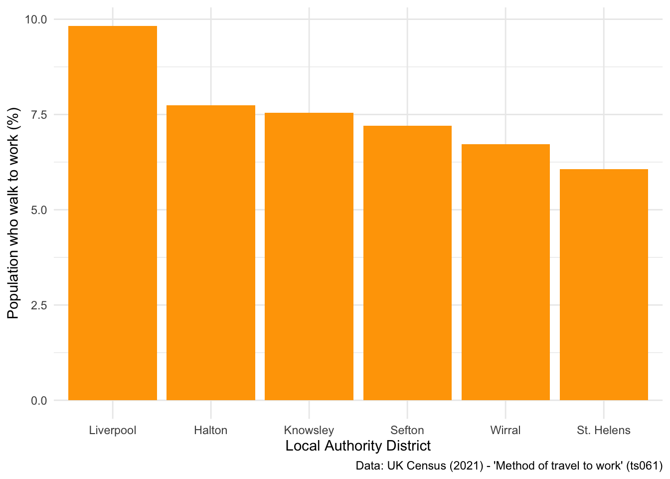
Now let’s think about how we can look at differences in commuting patterns between all modes of transport. To do so, we need to calculate the average percentage of people using each mode of transport, in each LAD. Below I show how this can be done using the summarise_all() function, which can be applied when all columns are of the same data type:
## Calculate average use of modes of transport between LADs
lcr_avg <- db_lcr %>%
select(-c(LSOA21CD, total, LAD22CD)) %>% ## first you'll need to drop columns that you don't need anymore
group_by(LAD22NM) %>% ## calculates a value for every LAD
summarise_all(mean) ## calculates the mean value of every column, for every LAD
## Look at the result
head(lcr_avg)# A tibble: 6 × 12
LAD22NM work_from_home underground_metro train bus_minibus_coach taxi
<chr> <dbl> <dbl> <dbl> <dbl> <dbl>
1 Halton 23.5 0.0407 0.778 3.68 0.891
2 Knowsley 20.5 0.0734 2.52 7.29 2.08
3 Liverpool 25.4 0.256 2.40 11.4 1.82
4 Sefton 27.7 0.149 3.09 4.16 1.40
5 St. Helens 22.5 0.0369 1.12 3.75 1.16
6 Wirral 26.6 0.239 2.65 4.52 0.958
# ℹ 6 more variables: motorcycle <dbl>, car_driving <dbl>, car_passenger <dbl>,
# bicycle <dbl>, foot <dbl>, other <dbl>Now we need to think about reshaping this dataset. Why?
Well if you look at the code used to produce the bar plot seen above, you’ll notice you can only put one command for x and y in the aes() parameter. Thus, we need to reshape our data from wide to long, so that all the %s are within one neat column that can be specified as the y axis variable.
Don’t worry if this doesn’t make too much sense. The more you practice ggplot, the more you will begin to understand why reshaping is an important part of the grammar of graphics:
## Reshape the dataset from wide to long
lcr_avg <- lcr_avg %>%
pivot_longer(!LAD22NM, names_to = "variable", values_to = "avg_pct")
## Have a look at the output
head(lcr_avg)# A tibble: 6 × 3
LAD22NM variable avg_pct
<chr> <chr> <dbl>
1 Halton work_from_home 23.5
2 Halton underground_metro 0.0407
3 Halton train 0.778
4 Halton bus_minibus_coach 3.68
5 Halton taxi 0.891
6 Halton motorcycle 0.410 Ok, so now we have all the modes of transport in one column, and a corresponding column which details the % of people who use that mode of transport. Let’s explore some visualisation options here - firstly, a stacked bar chart. Notice the additional parameter set in the aes() command, which tells R to colour the bars by the different modes of transport.
## Stacked bar chart
ggplot(data = lcr_avg, aes(x = LAD22NM, y = avg_pct, fill = variable)) +
geom_bar(stat = "identity") +
labs(x = "Local Authority District", y = "(Average) Population (%)",
caption = "Data: UK Census (2021) - 'Method of travel to work' (ts061)") +
theme_minimal() 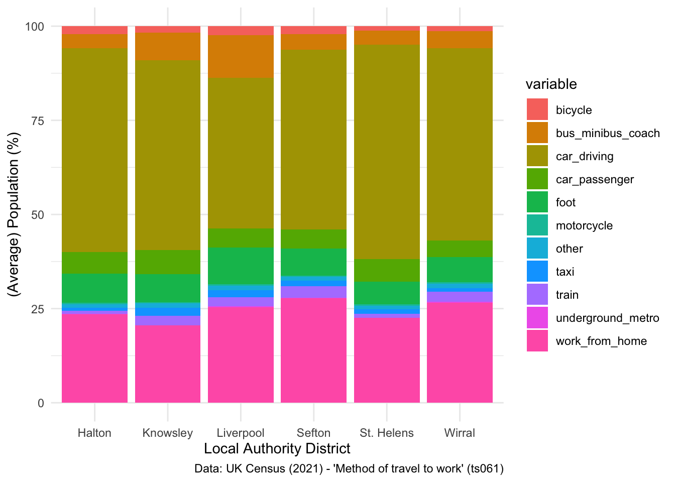
There are a few things you can do to change the legend title used to represent the different colours, firstly you can set a new legend title using the labs() command:
## Change label
ggplot(data = lcr_avg, aes(x = LAD22NM, y = avg_pct, fill = variable)) +
geom_bar(stat = "identity") +
labs(x = "Local Authority District", y = "(Average) Population (%)", fill = "Mode of Transport",
caption = "Data: UK Census (2021) - 'Method of travel to work' (ts061)") +
theme_minimal() 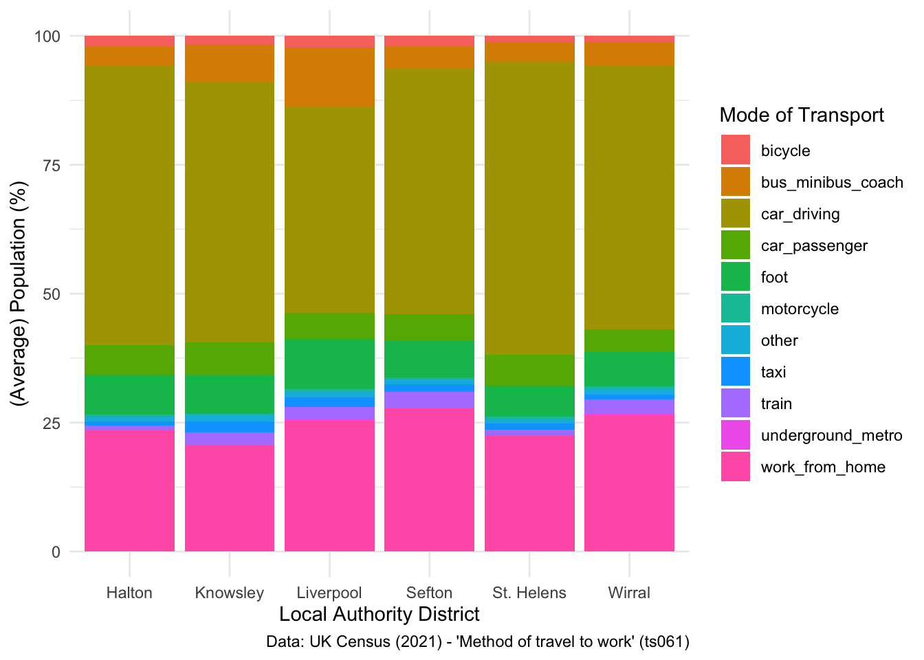
Second, you can remove it completely:
## Remove label
ggplot(data = lcr_avg, aes(x = LAD22NM, y = avg_pct, fill = variable)) +
geom_bar(stat = "identity") +
labs(x = "Local Authority District", y = "(Average) Population (%)", fill = NULL,
caption = "Data: UK Census (2021) - 'Method of travel to work' (ts061)") +
theme_minimal() 
Or reposition the labels to be at the bottom of the plot:
## Change label
ggplot(data = lcr_avg, aes(x = LAD22NM, y = avg_pct, fill = variable)) +
geom_bar(stat = "identity") +
labs(x = "Local Authority District", y = "(Average) Population (%)", fill = NULL,
caption = "Data: UK Census (2021) - 'Method of travel to work' (ts061)") +
theme_minimal() +
theme(legend.position = "bottom")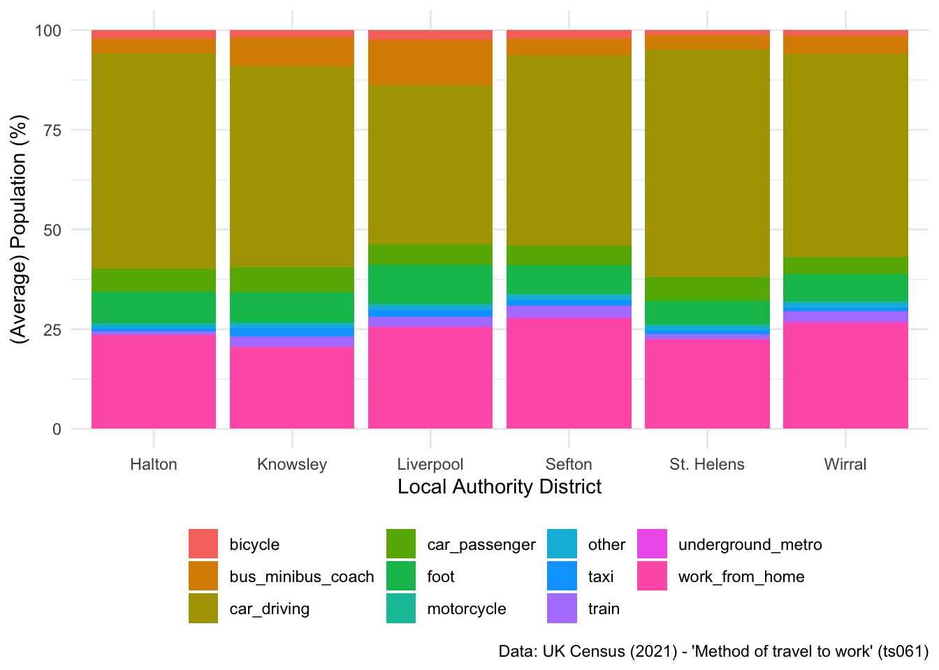
However, I think for something like average populations, it’s better to use an unstacked bar chart, which tells a much clearer story. Furthermore, I would probably swap what is being plotted on the axis, to make the plot even clearer, and flip the axis so you can see the different x axis labels.
## Unstacked bar chart
ggplot(data = lcr_avg, aes(x = variable, y = avg_pct, fill = LAD22NM)) +
geom_bar(stat = "identity", position = "dodge") +
labs(x = "Mode of Transport", y = "(Average) Population (%)", fill = NULL,
caption = "Data: UK Census (2021) - 'Method of travel to work' (ts061)") +
coord_flip() +
theme_minimal() 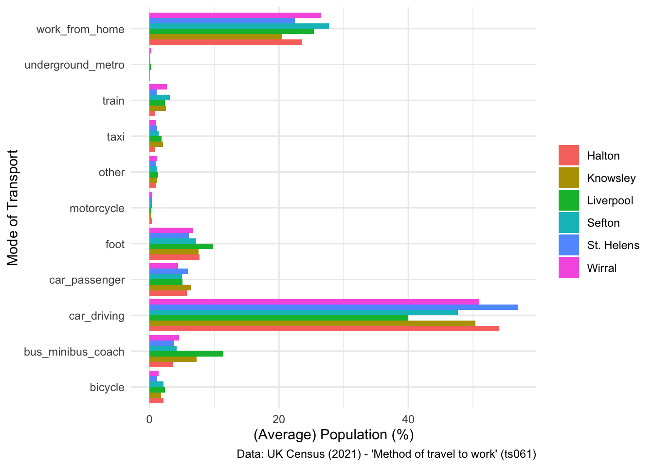
2.4.1 Independent exercise - Over to you!
Have a go at the following:
- See what changes if you ask the summarise_all() command above to calculate median instead of mean.
- Have a go at changing the colour palette used on the plot above, using the scale_fill_brewer() command. Have a look at the documentation for some help with this.
- See if you can figure out how to generate a facet plot, where six individual plots are created, one per LAD, instead of applying different colours for each LAD. Have a look at this tutorial for some support with this.
SOLUTION - EXERCISE 2
## My solution
ggplot(data = lcr_avg, aes(x = variable, y = avg_pct, fill = LAD22NM)) +
geom_bar(stat = "identity", position = "dodge") +
scale_fill_brewer(palette = "Dark2") +
labs(x = "Mode of Transport", y = "(Average) Population (%)", fill = NULL,
caption = "Data: UK Census (2021) - 'Method of travel to work' (ts061)") +
coord_flip() +
theme_minimal() 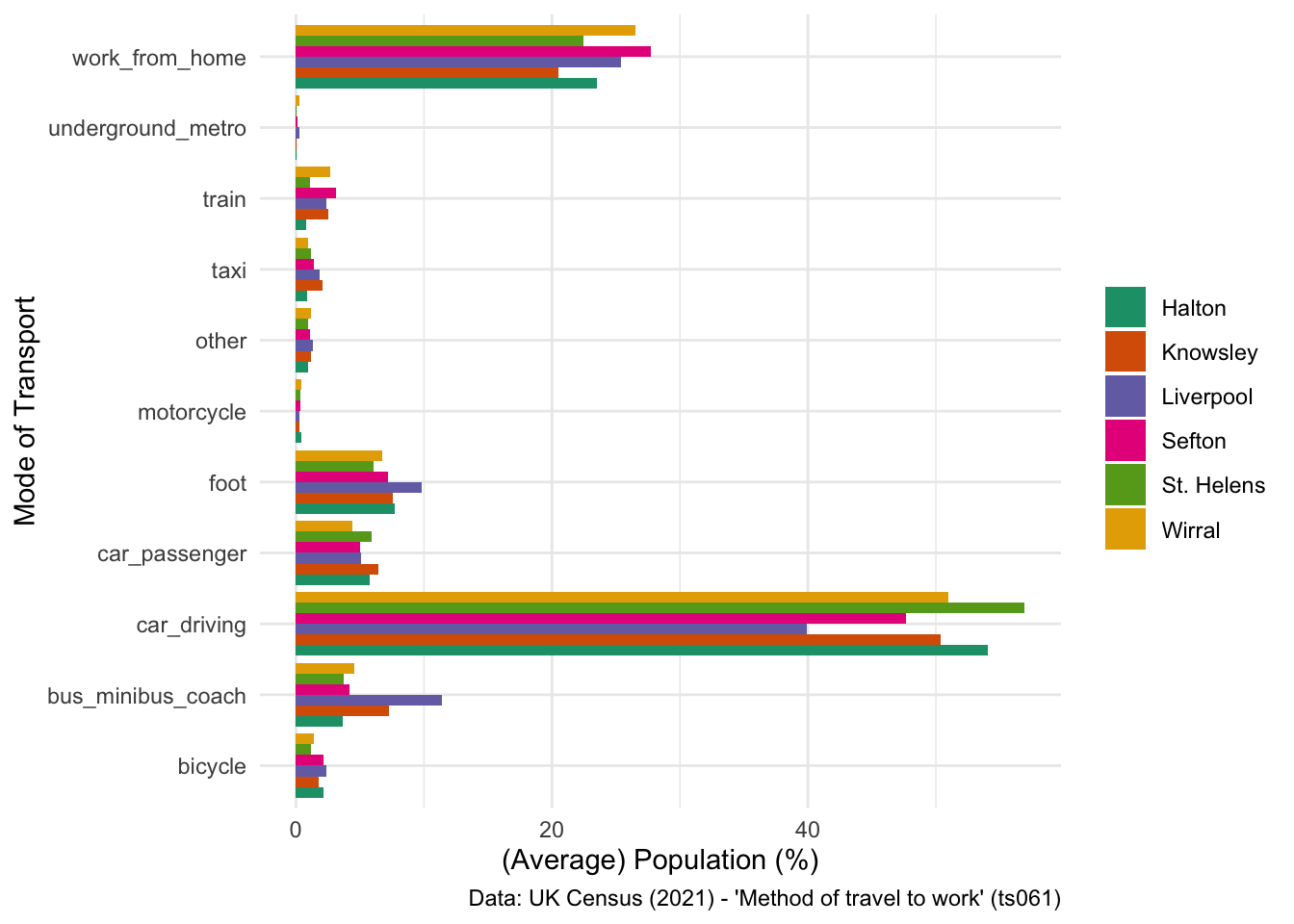
SOLUTION - EXERCISE 3
## My solution
ggplot(data = lcr_avg, aes(x = variable, y = avg_pct)) +
geom_bar(stat = "identity", position = "dodge") +
scale_fill_brewer(palette = "Dark2") +
labs(x = "Mode of Transport", y = "(Average) Population (%)", fill = NULL,
caption = "Data: UK Census (2021) - 'Method of travel to work' (ts061)") +
coord_flip() +
facet_wrap(~ LAD22NM) +
theme_minimal() 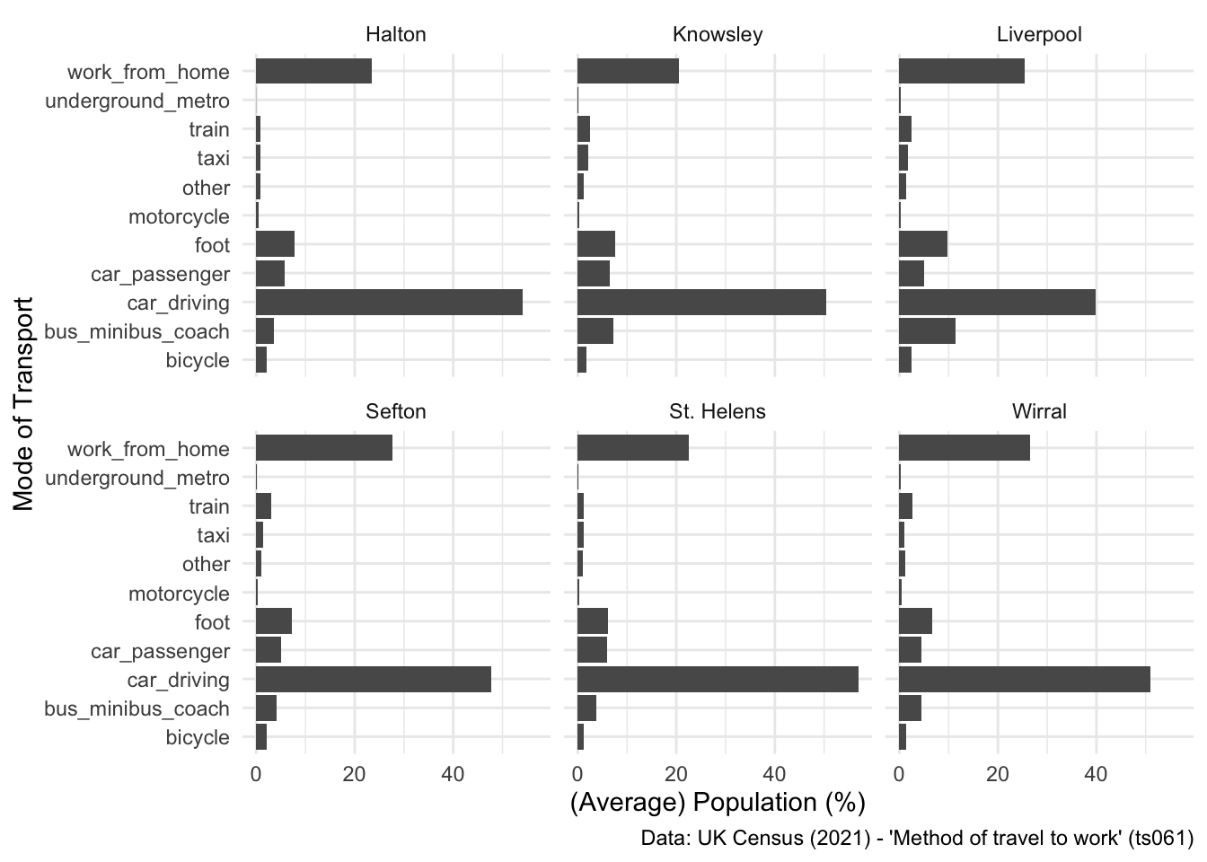
2.4.2 For the spatial peeps!
Finally, before we move on to talk about interactive visualisations, I want to do a quick overview of how you can use R to make maps. There is a whole host of GIS functionality within the R ecosystem (see links below), but one of the nice things about R is that it also works really well as as a cartographic tool.
Let’s return to our original dataset - LSOA level breakdown of different commuting patterns:
## Inspect
head(db) LSOA21CD total work_from_home underground_metro train bus_minibus_coach
1 E01000001 866 73.78753 4.041570 1.963048 1.501155
2 E01000002 881 76.73099 3.518729 1.135074 1.702611
3 E01000003 1000 61.80000 7.400000 2.100000 2.600000
4 E01000005 496 40.92742 13.911290 5.040323 8.870968
5 E01000006 888 21.62162 23.085586 11.711712 6.756757
6 E01000007 1385 26.71480 25.848375 12.779783 8.447653
taxi motorcycle car_driving car_passenger bicycle foot other
1 0.4618938 0.3464203 2.078522 0.0000000 2.7713626 12.586605 0.4618938
2 0.2270148 0.1135074 2.156640 0.3405221 2.8376844 10.442679 0.7945516
3 0.4000000 0.4000000 2.400000 0.7000000 6.2000000 14.300000 1.7000000
4 0.4032258 0.6048387 6.653226 0.2016129 3.6290323 18.145161 1.6129032
5 0.1126126 0.5630631 25.563063 1.1261261 0.6756757 6.869369 1.9144144
6 0.5776173 0.2166065 15.884477 1.5162455 1.5162455 5.126354 1.3718412
LAD22CD LAD22NM
1 E09000001 City of London
2 E09000001 City of London
3 E09000001 City of London
4 E09000001 City of London
5 E09000002 Barking and Dagenham
6 E09000002 Barking and DagenhamWe are going to be producing an LSOA-level map for Liverpool City Region Combined Authority, so let’s filter the dataset to the six LADs in LCRCA:
## Filter to LCRCA
lsoa_lcr <- db %>%
filter(LAD22NM == "Liverpool" | LAD22NM == "Wirral" | LAD22NM == "St. Helens" | LAD22NM == "Sefton" | LAD22NM == "Knowsley" | LAD22NM == "Halton")Now we need a set of LSOA polygons to plot the map with. You covered spatial data formats briefly yesterday with Francisco, so this should be relatively familiar. We have provided a set of LSOAs for Liverpool, which you can read in as below:
## Read in the LSOAs
lsoa <- st_read("data/LCR-LSOA.gpkg")Reading layer `LCR-LSOA' from data source
`/Users/franciscorowe/Dropbox/Francisco/Research/grants/2024/lcr_training/lcr-training/data/LCR-LSOA.gpkg'
using driver `GPKG'
Simple feature collection with 1043 features and 7 fields
Geometry type: MULTIPOLYGON
Dimension: XY
Bounding box: xmin: 318351.7 ymin: 377513.8 xmax: 361791.1 ymax: 422866.5
Projected CRS: OSGB36 / British National Grid## Inspect
head(lsoa)Simple feature collection with 6 features and 7 fields
Geometry type: MULTIPOLYGON
Dimension: XY
Bounding box: xmin: 356526.1 ymin: 397294.1 xmax: 359746.3 ymax: 399734.2
Projected CRS: OSGB36 / British National Grid
LSOA21CD LSOA21NM GlobalID Rank. Decile
1 E01006220 Wigan 035A {6A968831-6B5B-42A7-AFDE-9A2FD2E01FE2} 5 5
2 E01006225 Wigan 036B {0727B328-8FBD-4074-A887-A40CB89502E2} 9 9
3 E01006226 Wigan 035E {8A587355-7518-47EF-A60A-6CB117F54F05} 8 8
4 E01006227 Wigan 038A {CC387BCB-5B3B-4E57-ABA3-4ADB3175D624} 8 8
5 E01006264 Wigan 036D {89C9660D-5EC9-4498-BEBF-BED018377F41} 10 10
6 E01006346 Wigan 038E {37DD7E6B-F345-400F-BD76-D8700BFCE534} 7 7
Top Bottom. geom
1 17.47911 42.96657 MULTIPOLYGON (((359223.5 39...
2 39.40579 27.52150 MULTIPOLYGON (((356696.7 39...
3 29.37013 36.02265 MULTIPOLYGON (((358079.4 39...
4 27.95950 37.14953 MULTIPOLYGON (((359464.4 39...
5 38.51224 26.55367 MULTIPOLYGON (((356526.2 39...
6 28.96305 36.88915 MULTIPOLYGON (((359465.7 39...The ‘geom’ column is the most important here - this is what stores the spatial information needed to produce maps. Let’s just extract the LSOA code and the ‘geom’ column.
## Tidy up
lsoa <- lsoa %>%
select(LSOA21CD, geom)Ok, final ‘boring’ step before getting to mapmaking is the joining of our census data with the polygons. As you can probably see from your environment, there is a mismatch between the number of rows in the ‘lsoa’ object and our ‘lsoa_lcr’ object which contains the census data. Thus, when we merge these two datasets together, we want it to return only those rows which match:
## Merge census data with polygons
lsoa <- merge(lsoa, lsoa_lcr, by = "LSOA21CD", all.y = TRUE)Now we’re ready to make a map! Let’s return to some ggplot fundamentals - remember that you need to set the data, but this time ignore the aesthetics:
## Set the data
ggplot(data = lsoa)
Now, to plot a map using ggplot, you need to use a specific geom type that was built for mapping with - geom_sf(). Remember that the data type of our spatial data is called a ‘simple feature’ or ‘sf’:
str(lsoa)Classes 'sf' and 'data.frame': 1003 obs. of 16 variables:
$ LSOA21CD : chr "E01006412" "E01006413" "E01006414" "E01006415" ...
$ total : int 570 524 481 956 588 529 547 755 1337 623 ...
$ work_from_home : num 11.23 12.6 9.98 18.93 15.48 ...
$ underground_metro: num 0 0 0 0.209 0.17 ...
$ train : num 0.702 0.954 0.832 1.883 1.19 ...
$ bus_minibus_coach: num 16.67 19.66 20.17 5.13 9.35 ...
$ taxi : num 3.33 3.82 3.53 2.3 2.89 ...
$ motorcycle : num 0.351 0.573 0.416 0.314 0 ...
$ car_driving : num 47.7 45.6 47.2 54 43.9 ...
$ car_passenger : num 10.53 8.21 7.48 6.69 8.84 ...
$ bicycle : num 2.98 1.15 1.66 1.99 4.08 ...
$ foot : num 5.96 6.3 8.32 7.32 13.61 ...
$ other : num 0.526 1.145 0.416 1.255 0.51 ...
$ LAD22CD : chr "E08000011" "E08000011" "E08000011" "E08000011" ...
$ LAD22NM : chr "Knowsley" "Knowsley" "Knowsley" "Knowsley" ...
$ geometry :sfc_MULTIPOLYGON of length 1003; first list element: List of 1
..$ :List of 1
.. ..$ : num [1:407, 1:2] 342810 342810 342809 342808 342779 ...
..- attr(*, "class")= chr [1:3] "XY" "MULTIPOLYGON" "sfg"
- attr(*, "sf_column")= chr "geometry"
- attr(*, "agr")= Factor w/ 3 levels "constant","aggregate",..: NA NA NA NA NA NA NA NA NA NA ...
..- attr(*, "names")= chr [1:15] "LSOA21CD" "total" "work_from_home" "underground_metro" ...Geom_sf works really well with these types of data, so let’s add it to the code above and see what happens:
## Add a polygon geom
ggplot(data = lsoa) +
geom_sf()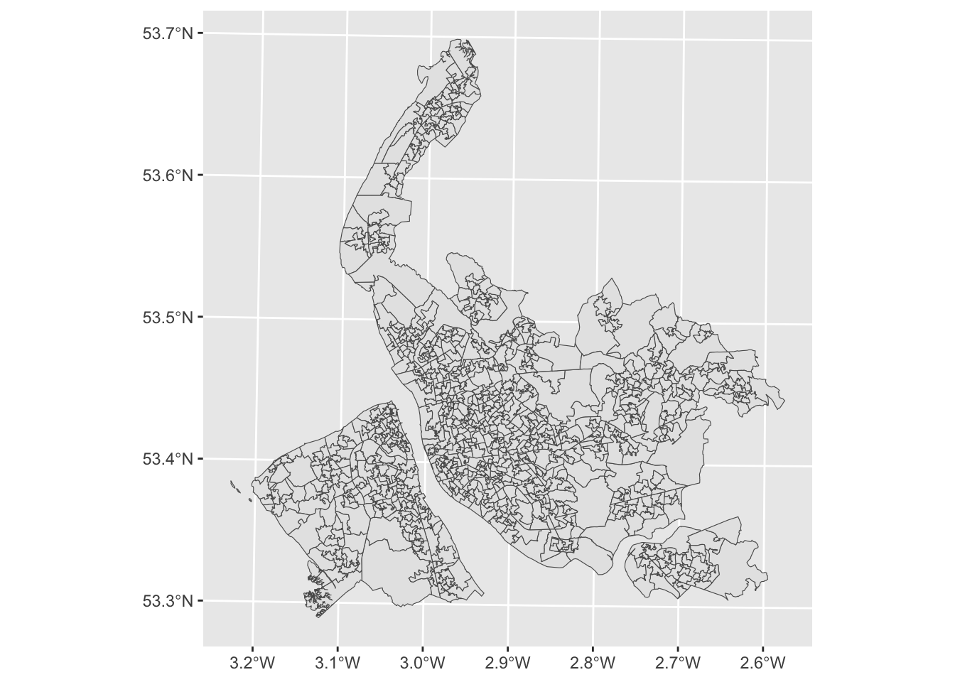
Nice! Almost there… now just to tweak the geom_sf command to enable colouring of the polygons based on values. In this example let’s focus on train usage. Notice how aes() is used directly in the geom_sf() command this time instead of in the ggplot() command.
## Plot a choropleth map
ggplot(data = lsoa) +
geom_sf(aes(fill = train)) 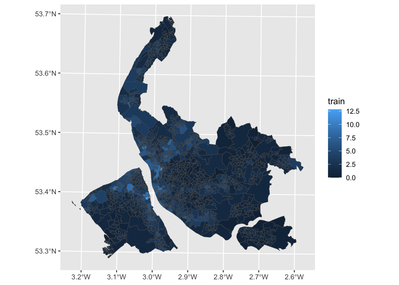
Awesome! Now let’s tweak some of the plotting parameters to make this much more effective:
## Improve the map
ggplot(data = lsoa) +
geom_sf(aes(fill = train), color = NA) + ## color = NA removes the borders
scale_fill_viridis_c() + ## sets a different colour palette
labs(fill = "Rail Commuters (%)", caption = "Data: UK Census (2021) - 'Method of travel to work' (ts061)") + ## some labels
theme_minimal()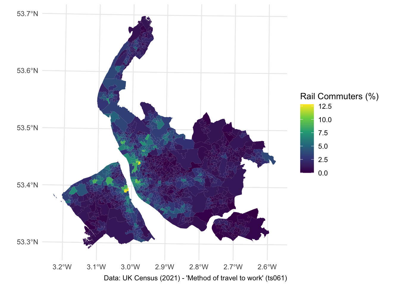
Awesome! You’ve made a really nice map using R with literally only a couple of lines of code. Take a look at Geocomputation with R if you are interested in learning more about how to use R to make maps, or as a GIS. The syntax for different spatial operations (spatial join, intersection etc.) is really intuitive!
2.5 Interactive data visualisation
Ok, so for the final part of today’s practical we are going to explore some options for producing interactive visualisations using R. By interactive we mean producing a visual representation of data that can be explored and analysed directly within the visualisation itself.
We will be focusing on two types of interactive visualisation:
- Interactive non-spatial - e.g. graphs, charts
- Interactive spatial - e.g. maps
2.5.1 Interactive non-spatial visualisations
Throughout today’s practical, we’ve constructed a large volume of static plots, like bar charts, histograms etc. If you want to turn any of these into something interactive, this is really easy! All you need to do is use ggplotly() function from the ‘plotly’ package, which converts an existing ggplot visualisation into something interactive.
Let’s test it on one of our earlier plots - the unstacked bar chart.
## Produce the static plot - note it needs to be saved as an object
p <- ggplot(data = lcr_avg, aes(x = variable, y = avg_pct, fill = LAD22NM)) +
geom_bar(stat = "identity", position = "dodge") +
scale_fill_brewer(palette = "Dark2") +
labs(x = "Mode of Transport", y = "(Average) Population (%)", fill = NULL,
caption = "Data: UK Census (2021) - 'Method of travel to work' (ts061)") +
coord_flip() +
theme_minimal()
## Produce the interactive version
ggplotly(p)How easy was that!
I think this works really well when you have quite a lot of information, and it’s difficult to unpack exactly the individual trends. A good example of this was the stacked bar chart we produced earlier:
## Produce the stacked bar chart again
p2 <- ggplot(data = lcr_avg, aes(x = LAD22NM, y = avg_pct, fill = variable)) +
geom_bar(stat = "identity") +
labs(x = "Local Authority District", y = "(Average) Population (%)", fill = NULL,
caption = "Data: UK Census (2021) - 'Method of travel to work' (ts061)") +
theme_minimal()
## Produce the interactive version
ggplotly(p2)There are lots of ways you can use an interactive plot like this. One is to utilise the Quarto formats we have introduced in this course to produce reports, where you embed the interactive visualisation within the report.
Alternatively, you can export the interactive chart to both .html and .png formats. To save as a .html file, you need the htmlwidgets package to be installed.
Let’s export the stacked bar chart as a .html file:
## First assign the interactive plot to a new object
i <- ggplotly(p2)
## Save the file
saveWidget(i, file = "figs/Stack.html")2.5.2 Independent exercise - Over to you!
- See if you can produce interactive versions of some of the other visualisations we have made today.
- Check you know how to save these to .html files
- (optional) Start tweaking what appears in the pop-ups on the interactive visualisations - you need to think about what data is being displayed from the original data frame, and how you might modify the original data frame to make the pop ups better.
2.5.3 Interactive spatial visualisations
If you want to turn the ggplot map we made earlier into something interactive, the easiest option is to actually use a different package - tmap. Tmap has a really nice hookup to leaflet, which makes it really easy to plot maps interactively.
To reproduce the map above in tmap, here’s the code:
## Choropleth map in tmap
tm_shape(lsoa) +
tm_fill(col = "train", title = "Rail Commuters (%)", palette = "viridis") +
tm_layout(frame = FALSE)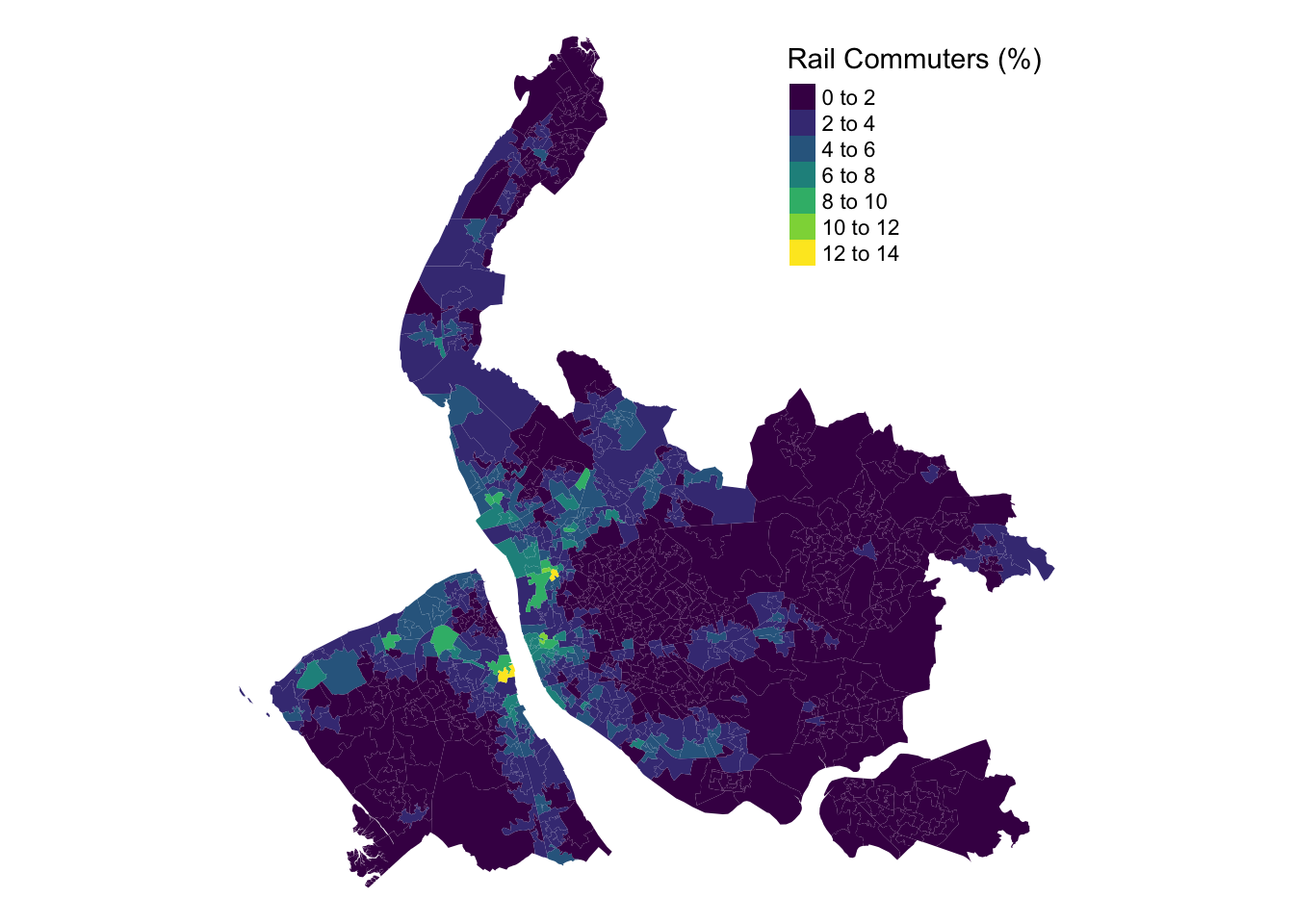
To make this interactive, you need to change the default plotting mode in tmap:
Replot the map and see what happens:
## Choropleth map in tmap (interactive)
tm_shape(lsoa) +
tm_fill(col = "train", title = "Rail Commuters (%)", palette = "viridis", alpha = 0.7) + ## Lower the transparency, so you can see the basemap
tm_layout(frame = FALSE)